Hey friends!
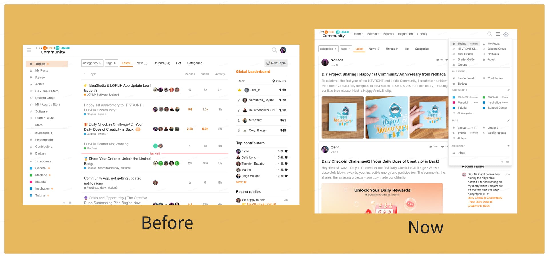
So, you know when you’re scrolling through our community page and thinking, “Hmm, I wish I could actually see those awesome project photos instead of just reading about them?” Well, guess what? We heard from you!
We’ve just given our community page a fresh new look—cleaner, smoother, and way more fun to explore. Here’s the lowdown on what’s new:
1. Posts Now Show Off Those Beautiful Pics (Finally!)
Yep, you read that right. No more boring walls of text! When you or your fellow crafters share a project in the community, you’ll actually see the photos right there on the Web Version as well. Get ready to be inspired by all the eye-catching DIYs, vinyl creations, and glittery masterpieces. Show off your work—you’ve earned it!
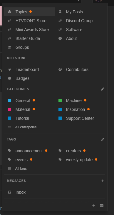
2. Everything’s Easier to Find with Our New Navigation
We moved the main menu from the left side up to the top (it’s tidier that way). It’s tucked away by default, but just hit that menu button and poof—everything pops up!
Plus, we added quick-access tabs so you can jump straight to what matters most: machines, materials, DIY projects… you name it. No more endless scrolling, just tap and go.
So why the glow-up? Simple: we want to make your experience better. Whether you’re looking for inspiration, troubleshooting a machine, or just sharing your latest creation, we’re making it easier and faster for you to connect and create.
Go check it out, post your latest project, and let us know what you think! We’re all ears.
Happy crafting!