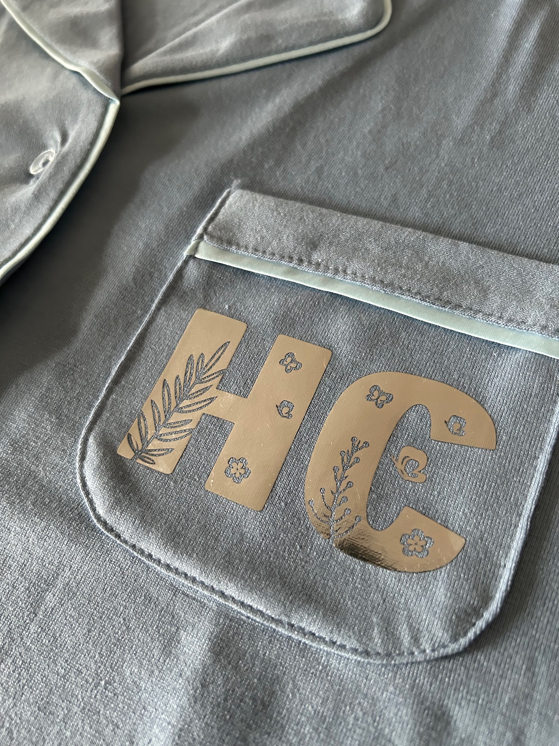
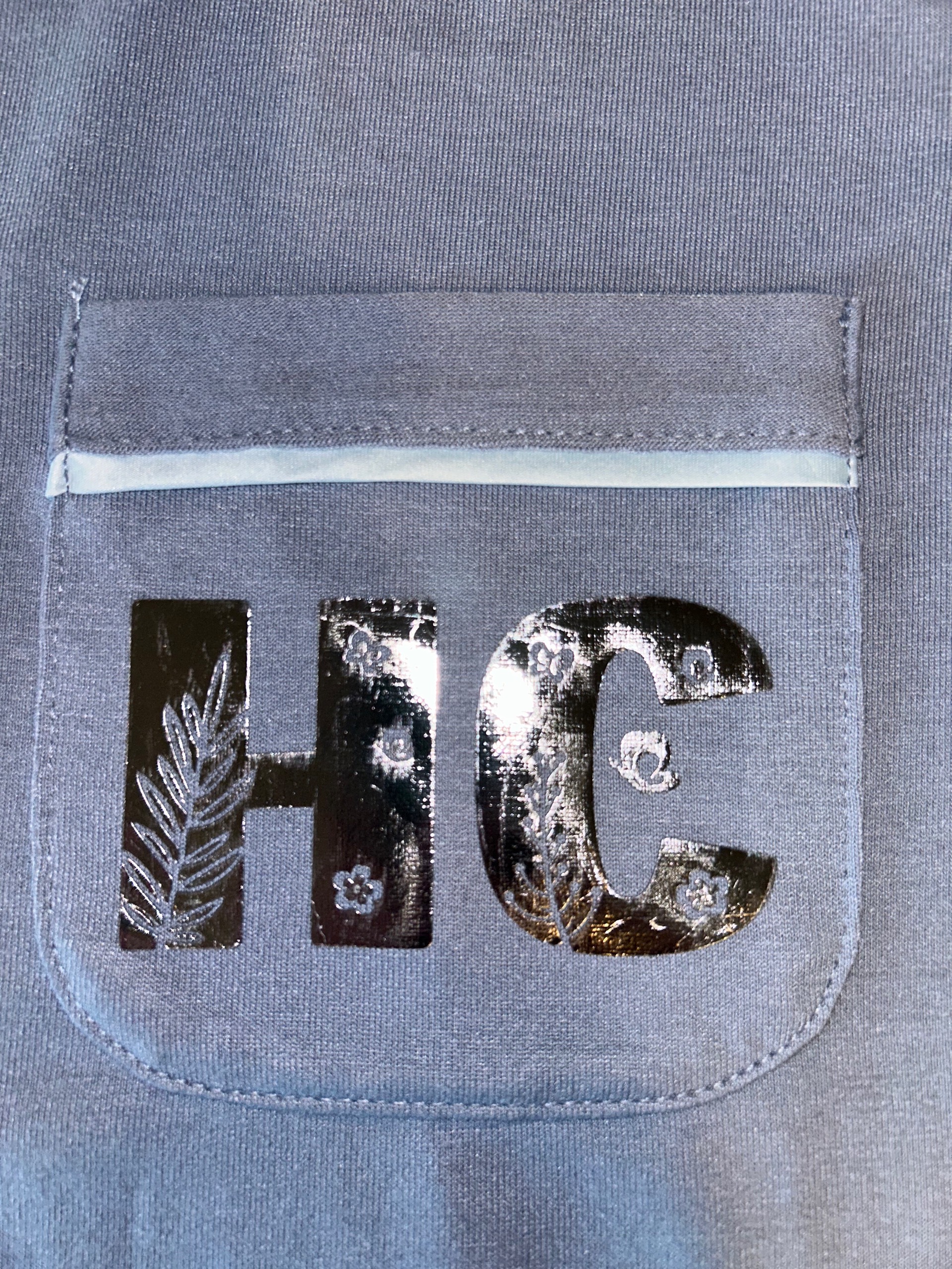
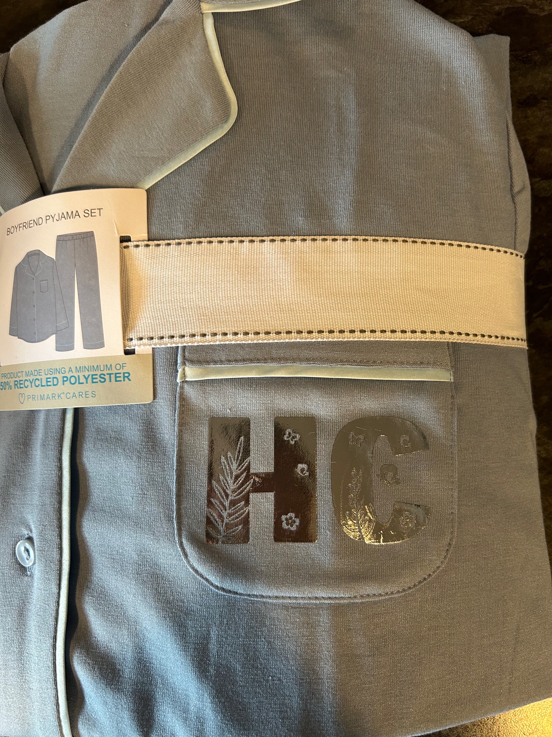
The font is called Flora Garden, from Creative Fabrica. It proved to be very challenging to weed (no pun intended), due to the very small details, even at a cap height of almost 2 inches.
I used Vinyl Frog silver chrome HTV and LOKLiK mini press 2.
Yeah, she absolutely loved the end result. They were just a little extra for her 21st last week. She phoned me from university just to say she loved how it looked when she had them on.
I actually look forward to weeding complex designs but some parts of this are so small that they’re at the limits of the machine and material, especially the butterflies and the tiny dots at the ends of the plants branches on the letter C.
The vinyl has a wonderful mirror shine, but it’s impossible to catch that on the photos.
The machine limit is 0,35cm for a line and for holes it can be even less than 1mm, but it can look almost an invisible hole.
The thiner line to the left is the 0,35cm. I make tests in a cloth when I have doubts. This is a test I made for my IQ+Da tee. This is for vinyls, which are easier to cut thin.
Here a tip: you can turn positive the weeding parts and aeparate feom the fills, I mean, extract the letters, in one side, and the cutting drawings in another. Then you can offset a bit the smaller parts of the hollow decorations, so that when you combine them back, you get a wider tiny shape. A bit complicated for me to explain, I hope it can understandable. If you can use a complex vector editor, it’d be easier.
Oh yeah, what a great idea, thanks. I use Affinity Designer, so that would be an easy fix. If I’d made a copy of the tiny circles, but slightly larger, it would have saved a lot of time in the end.
It’s ok, I realised what you’d meant when I read the post you’d linked. You’re absolutely right though, it’s much clearer with the thicker strokes, while still retaining the detail. I think the thinner stroke hands would have lost impact against the stronger text.
Just goes to show that the tests we do are indeed worthwhile, and can even save on waste in the long run.
I lied, I did use it on my daughters journal book, and I did a monogram of her name similar to your project. So there you go. My daughter was like you totally have mum, and ran and got her journal. Great minds think alike, and yes it was a pain to weed hahahaha, but it totally looks great
I know what you mean. There’s so many times I ask myself “Did I make xxxxx? I know I planned to make it.” Then I find a photo of the finished item in my phone!