💡 Insight Hub #11 | Style A or Style B — Which ldeaStudio™ UI Design Speaks to You?

Hey HTVRONT & LOKLiK Fam! :wave:

We’re back with Insight Hub Vol.11, and this time, we’re diving into something that shapes your creative experience —ldeaStudio™ UI design style!

From desktop to mobile, the look and feel of ldeaStudio™ interface plays a huge part in your crafting experience. :art: So we’d love to hear your thoughts!

:desktop_computer: Style A or Style B — You Pick!

Take a look at the two options below (note: design visuals only — please ignore the sample text) and zoom in to check out the details!

Style A:

Style B:

Which visual style feels right to you? Whether it’s the colors, layout, font clarity, or just the overall vibe — we’d love to know what clicks with you. :sparkles:

:clipboard: How to Join

:point_right: Take the quick survey: Which UI style do you prefer? Survey

:date: Survey Deadline: August 8, 2025

:gift: Reward: 1 lucky participant will receive a $10 gift as a thank-you for your input.

:speech_balloon: Let’s Discuss

Why did you choose Style A or Style B? Just share your reason — we’d love to hear your thoughts!

Your input helps us improve the design experience you interact with every day, let’s make it both beautiful and practical, together! :green_heart:

Let’s co-create something amazing together!

15 Likes

Style B for me
I’m sticking with the Loklik Blue, I prefer the cooling color or maybe make it a bit more of a soft pastel teal shade. I like orange but I think it’s too bright for me especially looking at it on a screen
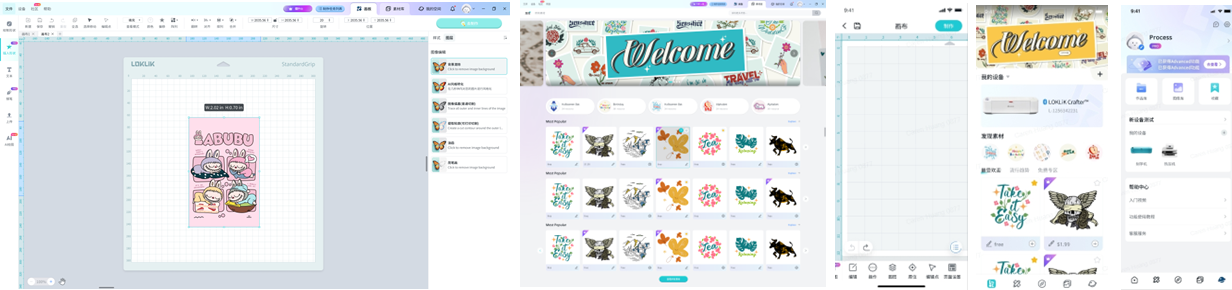
 :smiling_face_with_three_hearts:

9 Likes

Stick to the blue :blush: done survey

8 Likes

I liked A, it’s a classic look and makes the information pop.

6 Likes

I love :blue_heart::purple_heart: Style B! The color palette looks amazing on both desktop and mobile. I also appreciate that it includes a “Welcome” banner for users. And the Labubu image in Style B? I absolutely love it! :joy:

6 Likes

I second to that! I love Style B as well :smiley:

7 Likes

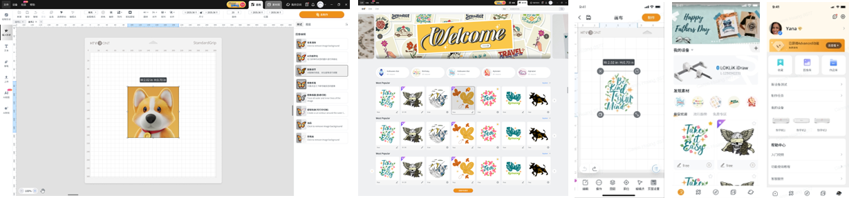
Style A for me, I prefer this because there is a general/classic vibe, also some dark color behind… contrast to my pastel tones I usually use, so my designs and other details will be emphasized… although shade of blue is my fave color. But for this one, I go with style A
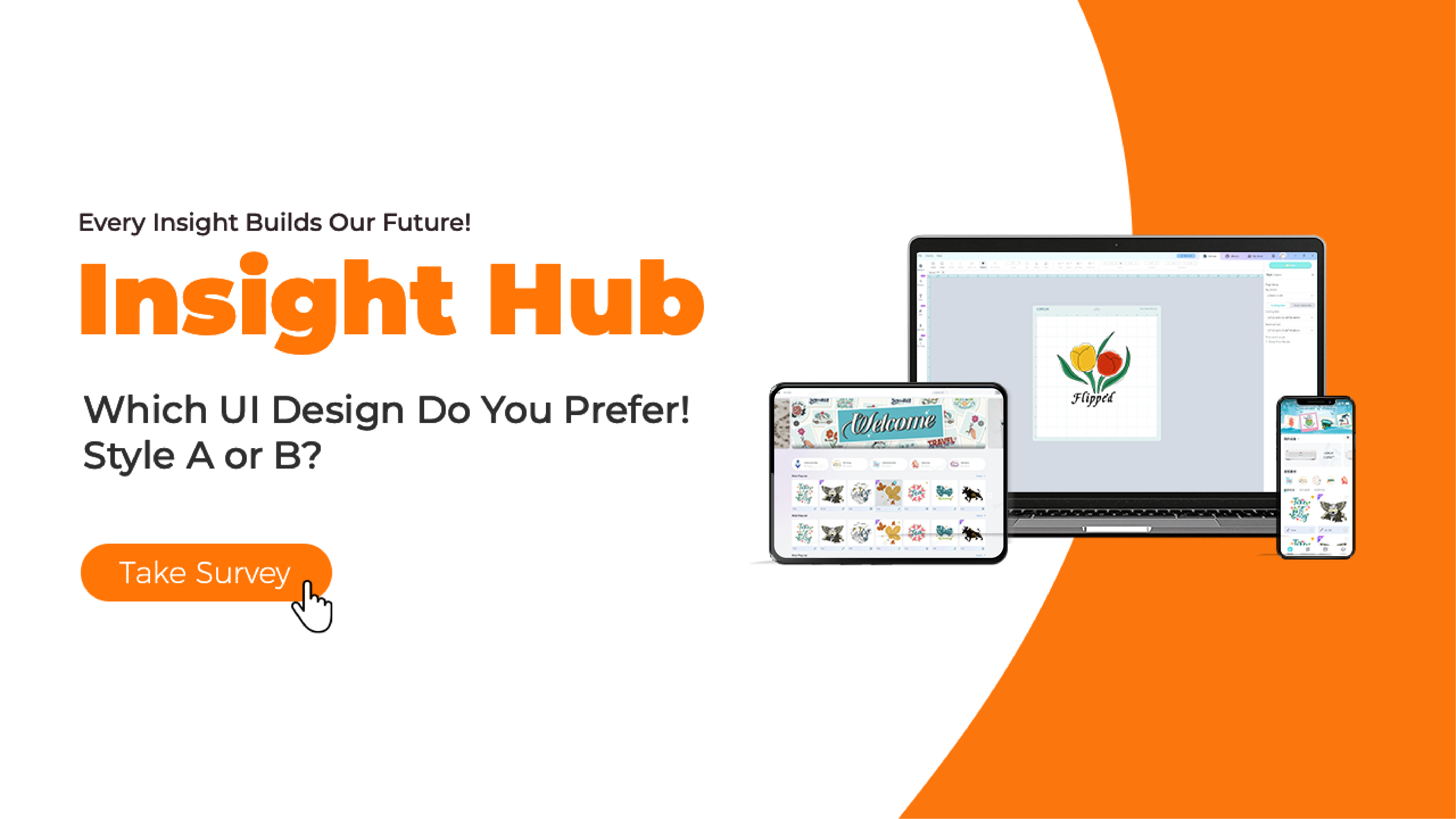
7 Likes

I prefer Option B,It’s feels like it’s loklik brand kinda way.Maybe I’m obsessed with blue​:sweat_smile::rofl:

6 Likes

B. If I have to choose one because it is not a theme to choose, I prefer blue as it is more calm and its hue is inspiring.

A layout is better, though. More neutral. But I would stick to the Loklik’s blue accent.

So I guess it’s a C: neutral layout + aqua blue

Please, don’t take away Loklik’s blue :sob:

In a perfect world: neutral layout and the whole current machines gamma to choose as theme.

6 Likes

I prefer Style B. I love the color combination. :smiling_face_with_three_hearts:

6 Likes

Style B!!! :smiling_face_with_three_hearts::sparkles:

5 Likes

I New you like Blue now! :sweat_smile::heart_hands::blue_heart::butterfly:

5 Likes

This :partying_face: I’d go with C too :face_with_hand_over_mouth:

3 Likes

I chose B. It’s so pretty :purple_heart:

6 Likes

If there’s a C I would agree :smile:. Style B is also nice for me, it has a soft and calm tone.

5 Likes

I went with the blue in the survey! Just love it and now associate that color to loklik!:joy: ever since the day I got my first original loklik cutter!

6 Likes

Style B
I like the slight color difference around the canvas. Blue is calming but it also feels like it brakes things up a bit more.

6 Likes

I chose B because of the blue, but I do like both

6 Likes

I filled out the survey! I love that HTVront and LokLik want to have input from their customers!

4 Likes

Style B for me!

done with the survey but I think I made a mistake with my paypal email :sweat_smile: oh well

thank you for always considering the insights of the community

3 Likes