After a few rather unsuccessful projects with cheap cardstock, I treated myself to some premium materials.
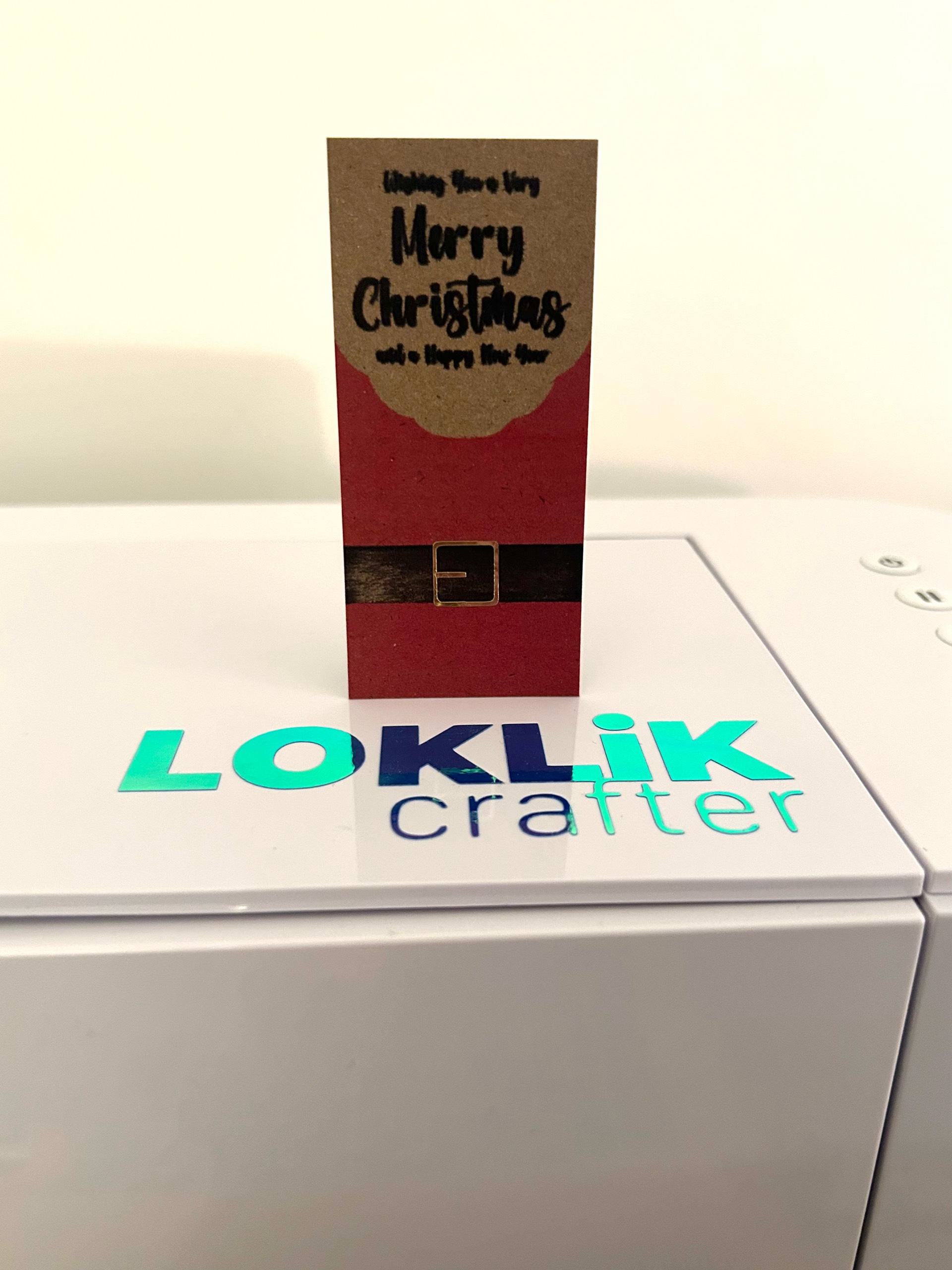
I’ve been wanting to try a project using pens with my Crafter since I got the machine 2 years ago, so I decided to take the plunge. While the Kraft board is a lovely material and very high quality, it appears a little dark in the photos. IRL, the contrast is much better and the ink looks much more vivid.
My red and black pens seemed to struggle to deliver ink quick enough to keep up with the Crafter. In future I intend to try a slightly slower drawing speed and reduce the line density, in the hope that this will enable better lay down of the ink. Also, while the black is great, colours seem a bit thin for Kraft, so I intend try white, or bright coloured, cardstock for colours in future.
The belt buckle in gold chrome permanent vinyl added a little bit of sparkle.
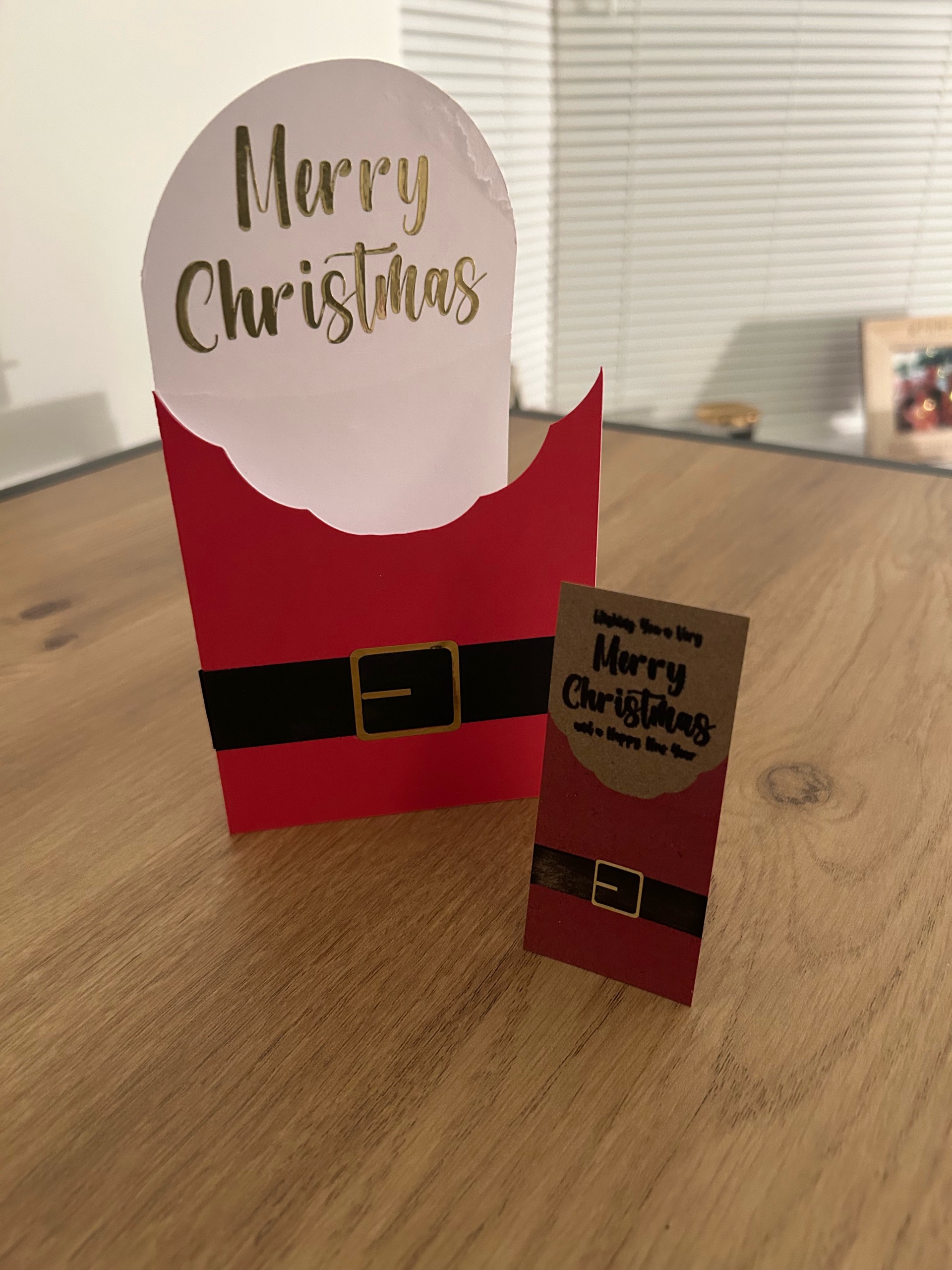
The design matches my Santa Christmas Cutaway Card project.
It is absolutely stunning @MCVDFC , I’m so happy with you finally tryingnthe pen function, and craft board is wonderfull for that indeed. I hope you can finally try with different pens. Gel pens work really well with the craft board if you accept my advice, and a set of pigment liners with different widths is the key to control line’s thickeness.
I’m sure you realized it is going to draw the ouline of the shapes, so it is very different drawing a shape design from a line design. If you want to convert to lines any shape design, krita’s vectorize tool works like a charm getting the centered line of any shape.
About speed, you can also use it to control the line thickness somehow, as slower speed makes a thicker line.
Getting back tonyou design, I absolutelly love it, you make really beautil minimal designs, and that is a plus, because it is not easy to make it rock with less, but you absolutely achieved it with that wonderful belt detail. Bravo!
BTW, that Loklik’s decal pic with the card throwing a shadow makes the vinil look awesome.
I’m definitely going to try some different pens. I’ve already got some gel pens, somewhere, but I’ve stored them so securely that I can’t find them now! I was also thinking about acrylic markers, as they seem to lay very much like acrylic paint does, so should give a good coverage. I’ve been collecting various materials to try as adapters for non-standard pens. I don’t want to spend more money on the Craverland adapters you have after my HobbyCraft haul last week. I’ll create a topic/post of my experiments and results soon.
I wanted to create this design entirely in IdeaStudio. I did consider using thinline fonts, but I wanted heavier text than those. So, I created a rectangle with height of 0.01” then copy/pasted at 0.02” intervals. I repeated this a few times then united them all and compacted them by reducing the height. I repeated this a few times until I was happy with the density. Then I remembered that I could have used array to automate most of that in seconds!
I then subtracted the lines patterns from my text and shapes. However, I also realised that most of that was not necessary and I did not actually need such a dense pattern, as a 0.4mm fineliner pen width is 0.0157” so it was just going over the same lines again and again.
As for the design, I am firmly in the ‘less is more’ camp, as you noticed. There’s beauty in simplicity.