I usually go with a bright color theme!
8 Likes
It really depends on the craft I personally like more neutral/ goes with everything colors but like htv the white chameleon is one of my favorites it’s mitral with a thou h of fun. But theirs some colors that are just always fun together like green and pink, orange and black.
6 Likes
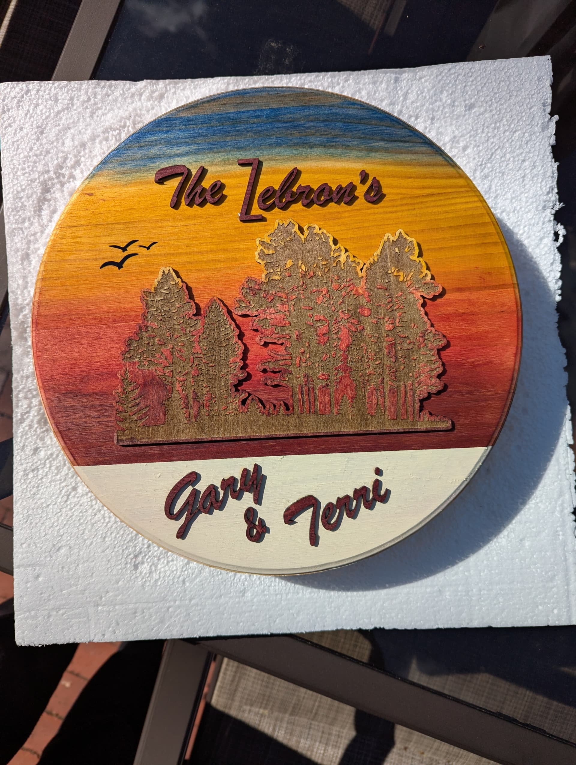
I have to stare at the item before laying out a design and it changes by the minute until I get it right. To color my wood, sometimes I stain or paint but most of the time, I hand dye it using Rit fabric dye. Lots of colors that are standard and mixing to get the right shade is pretty easy but the final product is a softer look than paint and richer than just using vinyl. This is a sign I made for a couple that bought a camper up north. I think the spirit of Bob Ross was looking over my shoulder while I blended all the tones.
8 Likes
Wow I love this style, it’s very eye catching. Bob Ross is like the master of colour blending
1 Like
I’m a Blue/gray/white/black team! ![]()
![]()
5 Likes
Love It!
3 Likes
I love the combination of orange and blue. I do most of my designs in those colours, to start with at least. Obviously these can be output in any colour vinyl I want for the end product, will only very rarely end up blue/orange.
If it’s something I want to be printed in 2 colours, I usually use gradients from light to dark of blue & orange, grey & red, and more recently dark purple & yellow or green.
4 Likes
Wow such a lovely combination ![]()
2 Likes
I would say it depends on the project sometimes I think too much between choosing baby pink or normal pink lol specially when I have to sort it with other color and sometimes I like to use a holographic color with a normal other color so in this case I have to put the vinyl rolls side by side and see which one matches the other the best.
6 Likes
Ooh yeah, I love the combination of holographic/chameleon vinyl together with a plain matt complementary colour vinyl.
5 Likes
I choose colors depending on the project, and the season, for example if I’m working on a spring flower shadow box I pick light or pastel colors, if it’s a Christmas project I like to use traditional colors like red, green, white, and gold, for Halloween is usually orange, purple and black. ![]()
![]()
5 Likes
I remember first year enrollment at Fine Arts Faculty, discovering all the subject offer, optionals and most of them mandatory, as first year.
Among them, covering many credits/hours, a subject simply called “Colour”. Coming from High School classic subjects I thought: woooww, isn’t it cool having a subject called simply Colour?!
It was. I got all the possible learning you can get about colour, every different scientific, poetic, theorical and practical point of view and approach. But only substractive synthesis, as the additive synthesis was a part of Photography I…
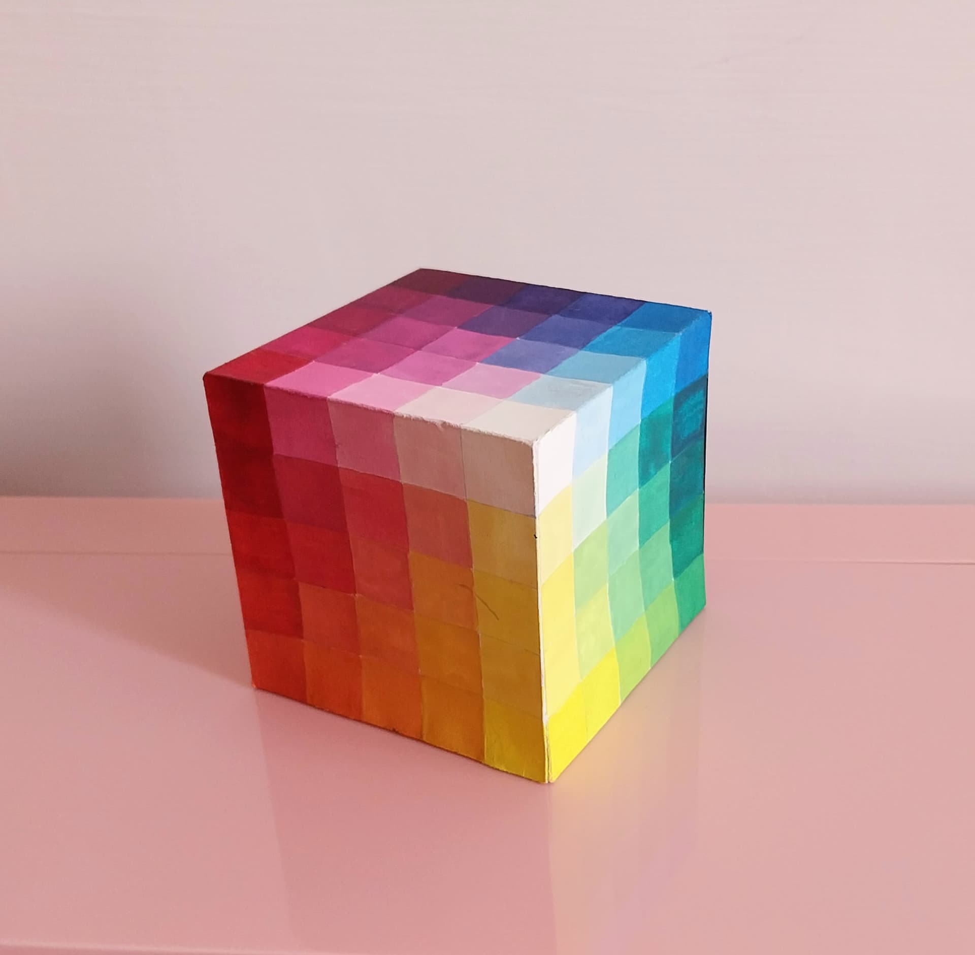
Haha I love those years and like to keep these memories. And I always like to keep an Alfred Hickethier cube around, in my craft room. This one starts to need a revamp soon. Maybe this time I’ll change the materials, but I like making it with gouache. That’s the perfect paint to deal with true colours.
7 Likes
Love those colors. So refreshing to the eyes ![]()
4 Likes
Orange and blue are complementary colours. Combining complementaries is the elementary of the matches, they always work well together. Purple and yellow, magenta and yellowish green, cyan and vermyllon… ![]()
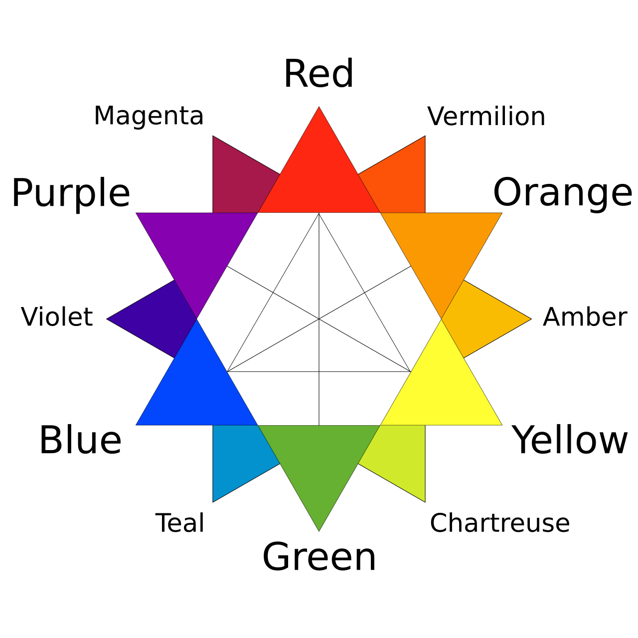
They are in the opposite side of the colour wheel. One complements the other because it has the tones the other lack. Or together they result in black (theoretically(.
Primary and tertiary, secondary with secondary…
I love colour theory, and love them all, I cannot give up on one!
4 Likes
I like Big Love 1! ![]()
Right said too!
Si besito! Love it!
Thank you ![]()
I love the Hickethier cube. I’ve never heard of them before but now I need one!
![]()
2 Likes
I love colour theory too, but I only know the basics.
I think it’s fascinating how culture affects the perception of colour.
3 Likes