Oh, thank you for your wonderful comment! ![]()
5 Likes
I feel the same way, and I always tell myself there is potential in scrap materials.
7 Likes
The one detail I do that I wish I didn’t is instead of just cutting out whatever I messed up, I redo the entire thing. Most times I can just use scrap paper and cut the part I messed up but I end up just re cutting the entire thing.
7 Likes
Thank you @OliviaZzz so fun topic! ![]()
2 Likes
I always Start with a little simple designe ang goin to do it I used to complicate more and more “perfectioning” evetrhing and it take me to long! At the final customer so happy and me, destruyed!
4 Likes
Correct!
3 Likes
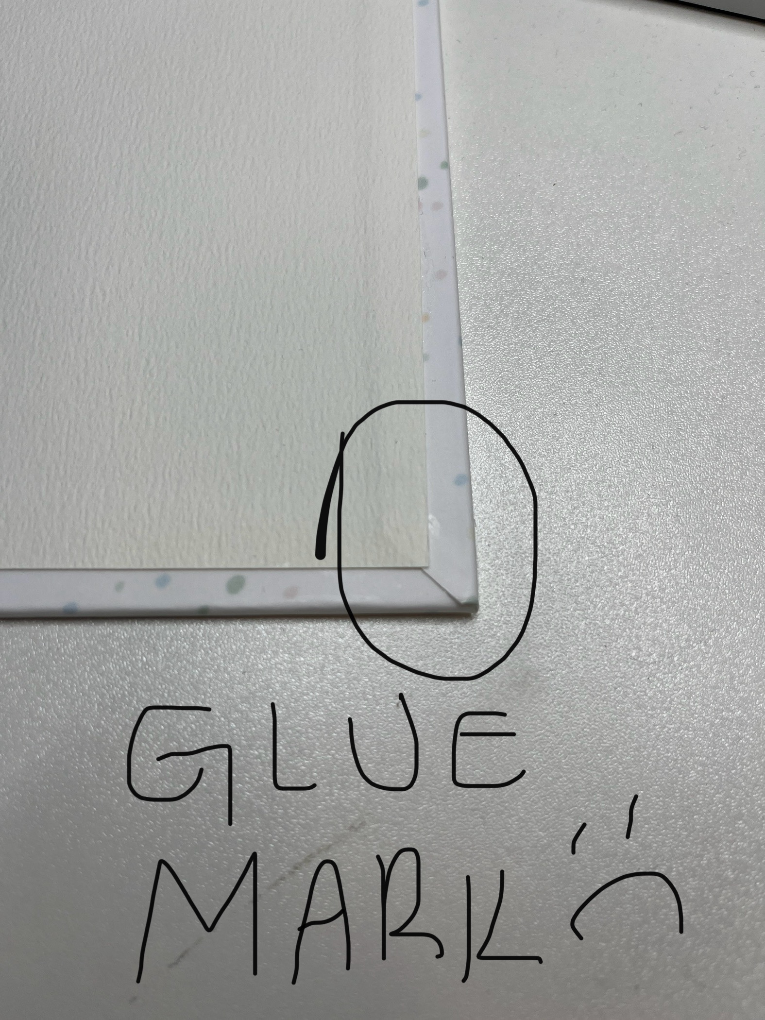
When I’m making an album cover, if this corner isn’t looking pretty, I’ll redo the cover as many times as necessary.
or if there is any visible glue stain I will redo it too
5 Likes
I would have to say “Alignment” when I lay something down it may look off to me however to someone else it looks perfect!
6 Likes
Making sure everything is centered and aligned correctly. From creating the design, making sure everything is aligned perfectly to pressing, making sure the design is centered just right. I’m a perfectionist and can’t help it.
8 Likes
I need to use every space for materials… I don’t like wasting it
6 Likes
I don’t obsess over anything; I obsess over EVERYTHING! Worst of all though is when I’m creating something in Affinity Designer, I’m moving things and adjusting nodes to a thousandth of an inch. I just won’t be satisfied otherwise.
6 Likes
I’m an OCD hostage, I surrender. I don´t want to bore you. I will just show an instance of my working space in Illustrator:

I need everything organized, named, coded… When I add a new layer, I have to give it a magenta colour. I have explained a bit lately on another topic. Magenta helps inspiration, is a well visible colour, it is a primary, not usually in the design, so it is my crutch colour. When it is used in the design or need a secondary support colour, now I’m using L’s blue.
If you enter my computer searching for something, and I’m not at home, I can tell you the path to the something by phone. I don´t desite this to anyone ![]() but at least it is useful.
but at least it is useful.
That’s the other part of the joke I have with my father, which is an activist of the “who cares?!” or “who cares if you can´t see it?!”. I don´t care it is not visible, I know it is there and if it is well done or not ![]() Some times I tell him “I don´t wanna know. Whatever, but I don´t want to see it and know that is there!”
Some times I tell him “I don´t wanna know. Whatever, but I don´t want to see it and know that is there!” ![]()
Friday Fun | Show Us Your Fun TEE!
![]() Update on my “IQ+Da” T-shirt project!
Update on my “IQ+Da” T-shirt project! ![]()

But I would go on and on. I have enough having to put up with myself, no need to share the burden with you ![]()
![]()
4 Likes