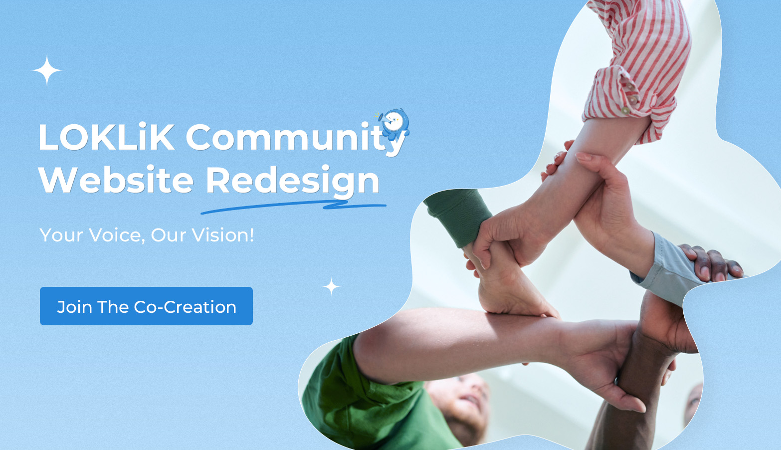
Your Voice Matters | Help Upgrade LOKLiK Community Website - Co-Create Our Future

Hi LOKLiK Fans,

At LOKLiK, we believe that the best communities are built together. As we look to enhance our online platform, we want you—our passionate DIY crafters and makers—to be at the center of this evolution.

“This isn’t just a website upgrade—it’s a reimagining of how we connect, create, and collaborate as a community. Your insights will help us build a platform that truly serves your creative journey.”

Co-Creation Timeline

How You Can Contribute

Visual Design Preferences

Help us create a visually appealing community that reflects the creativity and passion of LOKLiK users.

For example :arrow_double_down:

1. Color Scheme

Which color palette do you prefer for the new LOKLiK Community website?

2. Layout Style(Vote)
:point_right: What type of layout would you prefer for browsing projects/Post and discussions?

  • Grid Layout
  • List Layout
0 voters

Color scheme、Layout preferences、Typography choices、Project showcase style and so on. Share your visual design ideas below comments! :speech_balloon:

Features & Functionality

:one: Daily Check-in

Earn points and special rewards by checking in daily. Build streaks for bonus rewards and seasonal surprises.

:two: Daily Mission Center

Complete daily community tasks (e.g., browsing posts, check-ins, DIY challenges ,commenting, liking) to earn cheers/badges/rewards.

:three: Post Product Tagging

Posts will automatically display LOKLiK products and materials used at the bottom, making it easy to shop for supplies you see in inspiring community projects.


:four: Follow & Fans System

Build your creative network by following other makers and gaining followers. Get notified about new projects from your favorite creators.

:five: Smart Navigation Design

Personalized navigation that learns from your interests and browsing habits, showing you more of the DIY content you love.

The Top navigation bar include:Home、Forums、Tags、Milestone、LOKLiK Store、Search bar、Create Topic、Notification、User Center

:six: Theme challenge Zone:

Join themed DIY contests in the ‘Theme Challenge Zone’—follow prompts, submit creations, and compete for community recognition.

:point_right: Vote for the community features that would enhance your DIY experience(multiple choice)

  • Daily Check-in Rewards
  • Mission Center
  • Post Product Tagging
  • Follow & Fans System
  • Smart Navigation Design
  • Theme challenge Zone
0 voters

Have ideas for other features? Let us know in the comments! :speech_balloon:

Content Organization

:point_right: Help us organize content in a way that makes it easy to find inspiration and resources:

  • Organized by project types (clothing, home decor, etc.)
  • Organized by LOKLiK machine type
  • Organized by skill/difficulty level (Beginner, Intermediate, Advanced)
  • Organized by trending/seasonal projects
0 voters

Get Recognized For Your Contribution

Community Design Champion

The user whose design or feature suggestions have the most impact on the final redesign will be crowned our “Community Design Champion” and receive:

  • Featured spotlight on the new community homepage

  • Exclusive “Design Champion” profile badge and community status

  • Premium LOKLiK Surprise Box with exclusive items not available elsewhere

  • Opportunity to collaborate with the LOKLiK design team on future projects

Ready to Help Shape the Future of LOKLiK Community?

Share your ideas and be part of creating a community platform that truly reflects the needs and creativity of DIY enthusiasts worldwide. :speech_balloon: :revolving_hearts:

:memo:Note:The voting feature is currently not supported on mobile. Please visit the web version of this post to participate. https://community.loklik.com/

17 Likes

I really like the way Loklik tries to take into account users’ opinions and how it is always working to improve our experiences.

9 Likes

Loklik’s commitment to community input makes me so happy! This update clearly demonstrates their dedication to building a better product. Yay!:partying_face:

10 Likes

We couldn’t agree more, this is more than a website upgrade; it’s a thoughtful reimagining of how the Loklik community connects, creates, and collaborates. Kudos to the community for inspiring a platform that truly supports our creative journey.

10 Likes

Wow! Thanks loklik for all these updates☺️

8 Likes

Thanks for this opportunity to create a creative space for everybody.
I just have one design suggestion: please keep the possibility to set the color scheme to dark mode.

6 Likes

Note - My examples are super quickly done, and it should look prettier than this like rounded buttons and even spacing and better font etc. Just examples of what I’m trying to explain. I would love to work with the team to make this site easily accessible and awesome for the community as well as the LOKLiK Idea Studio. So without further ado here are my ideas so far.

First the appearance should still have the dark and light theme. You could add a couple different colour option themes for people that want to change it up LOKLiK Pink, Purple, Blue etc to match their machines if they want to.

Front page should have the LOKLiK community logo and the banner with the event information that is going on at the moment. (Theme challenge zone so its front and centre and no one misses out on the opportunity to participate. If there is no challenge at the time it should just display the welcome to the community if clicked then it takes them to the rules and guidelines of the community. This can be a carousel as it is now so it circles between them

Then it should have a tool bar.
Home – Forums – Milestones – My Posts – Tech support – Mini Awards Store - LOKLiK Store – Search Bar. (plus any more, I’ll probably think of more later. But the search bar should be the last thing on this list.) All these options should have a drop down menu example for forums, you should see a list of categories like

general,
machine type projects (sub menu – LOKLiK iCraft, LOKLiK Crafter, LOKLiK Impress Auto 2 etc, trending crafts,
material (sub menu – Adhesive Vinyl, HTV, Sublimation etc,
tutorials,
beginner projects,
intermediate projects,
advanced projects,

For the search feature because there is so many posts created by users you need to add all the content organization suggestions you had in your post. Add tags for project types, machines used, skill difficulty and seasonal tags etc. So when people search they can enter tags like adhesive vinyl, LOKLiK icraft, cup wrap and find all the projects that used this material and machine making a cup wrap. It will be up to all of us to use the write tags to make our content easy to find. Also, admins should go through posts and put them in the right category if they are not initially.

To the right of this tool bar should be a user profile picture which takes us to our profile. Next to that should be notification icon and then a mail icon. A number should be displayed on each of these icons if we have any messages or notifications.

Underneath the tool bar in the centre it should have a create a topic / discussion section. Where it’s super easy to create a topic / discussion and add the relevant tags for that discussion.

Then it should have an admin feed underneath that. This will be all block tile posts and are all updates and announcements from the admin team, so all these important messages are super easy to find. (Be a news feed)

Down the left hand side you should see some shortcuts to posts that you have previously interacted with. On the right hand side you should see your daily quests, along with global leaderboard and top contributors.

Example my illustration (don’t laugh, I did it super quick and its pretty rough, but it gives you an idea) Blocks of colour just represent the different sections.

Members profile should include a friend, follow and message button. When you follow, you will see notifications in your notifications panel of their new posts.

When you click on forums you should see the newest (within the week) posts. These should be in grid post view. Above that the toolbar should change to the categories mentioned above. So, people can easily navigate to what they want.

This is what I have come up with so far, I’ll add to my post if I think of anything else. Right now I have to go make dinner. Let me know what you guys think.

Ps. Also an in built text translation is needed ASAP. Just a pop up under the post that says translate text. I love talking to everyone but it does get frustrating when I have to open up Google translate. Lucky my pc and my mobile have two screens :grin:

11 Likes

Very well said! I like all your recommendations or suggestions specially in the Inspiration tab. That needs to be categorized efficiently in a way that an admin need to edit some tags or title if the creator missed it. I will think more to add to what you already said if I missed anything?

7 Likes

Wow, Glad I joined at the right time😃

8 Likes

We are also glad that you are here in the community.:smiling_face_with_three_hearts:

10 Likes

Welcome, nice to meet you…

9 Likes

I use dark mode. You need your device in dark mode as it seems

7 Likes

This is so nice,Well done Loklik👍

8 Likes

So am I, I’ll be here waiting for the new update and explore more

6 Likes

Yes So glad that I join in

8 Likes

So glad you did :heart_eyes:

6 Likes

Thankyou so muchh

6 Likes

Thanks for the update! I hope I can give inputs on this upgrade if time permits. Thank you for your dedication in building this community. :purple_heart:

4 Likes

I opened a couple of topics a few weeks ago about some community website features that needed small improvements (titled: Community Forum Layout is a Nightmare).


imagen

360 UX

Today I wouldn’t call it a nightmare. As I became more familiar with the site, things got easier to find and use. So now I’d say the learning curve is a bit steep, and I believe some of the points already discussed here and previous threads could help solve this — which I still see as a potential barrier for welcoming new users.

Links:

I opened the topic “Links: internal and external”, where I found out that the ability to use links depends on user levels. I can perfectly understand that. What I still see as an issue is that, for example, right now I’m adding links to this post, but I don’t know if they’ll work until I click the Answer button. There should be a clearer way to know if I have permission while drafting. For instance, if I don’t have the right to add links, just don’t let me insert them at all during the writing process

imagen
imagen

I’ve also thought of a few more ideas that would help:

Always accessible main menu:

With on-hover submenus at the top, removing the left sidebar.

imagen

In that menu/submenu/sub-submenu system, all categories should be visible at once, unlike now:

Classic phpBB
(BTW this marker can only be one color, it should not be this)

A touch of classic phpBB forums would be great, with a deeper hierarchy of categories and subcategories to help with navigation and topic organization.

Always visible breadcrumbs

So users can easily navigate through different levels at any time.

imagen

Home

More space for admin topics on the homepage. Activities move fast, and it would be great not to “lose” them when a new post or announcement comes up. The homepage should act more as a summary, and we don’t need to see all the topics there — just be able to access a full list from it. It would also help if the thumbnails on the homepage could link to any section of the site. Or whatever solution the UX/UI design team finds effective for that matter.

Please, no more Corporate Memphis

I would absolutely eliminate Corporate Memphis illustration style. I don’t know if its negative connotations are widely known (hypocritical, soulless, anti-design, and a discredited style), but in my opinion, it’s a total mistake. Just search “The world’s most hated art style” or Corporate Memphis on YouTube to understand why. CM is a definite NO.

I’d stick to the “crafty” design instead. More of this and no Corporate Memphis — especially not mixed with the jelly-like skeuomorphism style (as seen here), which feels very outdated.

If another illustration/image style needs to complement the crafty look, I’d go with doodles and craft-themed elements. There are many clean and creative options out there. Maybe something a bit more artistic to encourage creativity.

In fact, the IS illustration line could be expanded here:

More html features

Text colors and sizes, and more HTML features in general would help organize long posts. Or if those features already exist, they should be made more visible. Maybe consider adding a WYSIWYG (What You See Is What You Get) mode. That way we could use the full width of the screen instead of the current split (one column for HTML, one for preview).

Improving edit mode layout

Sorry for the long post — I just wanted to explain all this as clearly as possible. I’m sure I’ll need to make some edits, but right now it’s hard to get the full picture because of the split layout. Also, if we expand the editor, we can’t see the thread we’re replying to (unless we keep switching fullscreen on and off).

I may come up with more ideas. If I do, I’ll post them here.

7 Likes

At the center of the page, there’s a big section that invites people to “Post a Craft!” Each post includes a title, the name of the creator, and icons showing how many likes and comments it has received, making it easy for users to interact and support one another.

On the left side, there’s a user profile showing the featured member, RageAppropriate (Sweet Carolin Argente), along with their country, total points, and options to view badges or visit a mini award store—highlighting a reward system to keep users motivated.

Below that, the “Top Contributors” section shows a list of the most active members with their profile pictures and points earned, helping to encourage friendly competition and recognition.

This image shows the “Post a Craft” interface, a simple and user-friendly form designed to let community members easily share their creative projects

On the left side, users can upload photos or videos of their project, making it easy to show off their work visually. On the right, there are input fields for the project title, a description, and the materials used, allowing users to give clear and helpful information about their craft.

At the bottom is a large “POST” button, making it straightforward for users to submit their creations to the community. This layout supports creativity and encourages sharing by being clean, intuitive, and visually balanced.

This image presents the Leaderboard section of a community website, designed to highlight and reward user participation.

At the top, users can choose how they want to view the leaderboard using three tabs:

  • Top Creators – showcasing users with the most contributions,
  • Recent Achievement – for highlighting newly unlocked milestones, and
  • Badge Earners – for those collecting special recognitions.

Each user’s entry includes a profile photo, name, and points earned, laid out in a card-style format that’s easy to scan visually. A sort button in the corner suggests users can filter or arrange the list based on specific criteria like time period or activity type.

This screen is from a Mini Award Store—a virtual rewards shop where users can trade in earned points (called “Cheers”) for physical prizes. It’s designed as a fun and motivating feature to recognize users’ efforts in a community or creative platform.

Each item listing includes:

  • A product image and rank or priority number,
  • Fields for product name, a brief description, and the number of Cheers needed to redeem it,
  • Two action buttons:
    • REDEEM – to claim the item if the user has enough Cheers,
    • SET AS GOAL – to bookmark the item and work toward earning it later.

This profile page showcases a creator’s personal space within the community. It highlights the user’s identity, including their profile picture, username, location, and total points earned—reflecting their engagement and achievements. Users can navigate through tabs such as “My Crafts,” “Saved Crafts,” and “Creators Following” to view posted projects, bookmarked content, and followed creators. A featured project is prominently displayed with a photo, title, heartfelt description, and list of materials used, offering a glimpse into the creator’s passion and process. Engagement icons at the bottom allow others to like and comment, fostering a sense of community and interaction among craft enthusiasts.

8 Likes