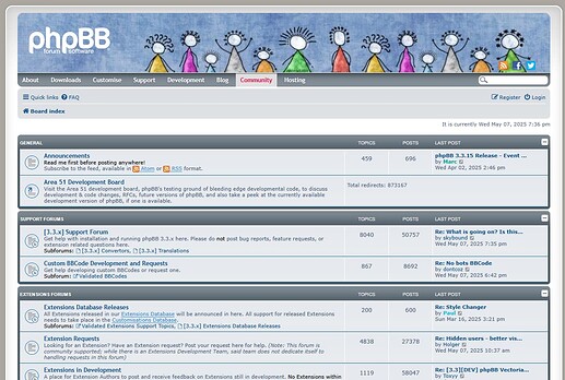
I opened a couple of topics a few weeks ago about some community website features that needed small improvements.
360 UX
Today I wouldn’t call it a nightmare. As I became more familiar with the site, things got easier to find and use. So now I’d say the learning curve is a bit steep, and I believe some of the points already discussed here and previous threads could help solve this — which I still see as a potential barrier for welcoming new users.
Links:
I opened the topic “Links: internal and external”, where I found out that the ability to use links depends on user levels. I can perfectly understand that. What I still see as an issue is that, for example, right now I’m adding links to this post, but I don’t know if they’ll work until I click the Answer button. There should be a clearer way to know if I have permission while drafting. For instance, if I don’t have the right to add links, just don’t let me insert them at all during the writing process
I’ve also thought of a few more ideas that would help:
Always accessible main menu:
With on-hover submenus at the top, removing the left sidebar.
![]()
In that menu/submenu/sub-submenu system, all categories should be visible at once, unlike now:
Classic phpBB
(BTW this marker can only be one color, it should not be this)
A touch of classic phpBB forums would be great, with a deeper hierarchy of categories and subcategories to help with navigation and topic organization.
Always visible breadcrumbs
So users can easily navigate through different levels at any time.
![]()
Home
More space for admin topics on the homepage. Activities move fast, and it would be great not to “lose” them when a new post or announcement comes up. The homepage should act more as a summary, and we don’t need to see all the topics there — just be able to access a full list from it. It would also help if the thumbnails on the homepage could link to any section of the site. Or whatever solution the UX/UI design team finds effective for that matter.
Please, no more Corporate Memphis
I would absolutely eliminate Corporate Memphis illustration style. I don’t know if its negative connotations are widely known (hypocritical, soulless, anti-design, and a discredited style), but in my opinion, it’s a total mistake. Just search “The world’s most hated art style” or Corporate Memphis on YouTube to understand why. CM is a definite NO.
I’d stick to the “crafty” design instead. More of this and no Corporate Memphis — especially not mixed with the jelly-like skeuomorphism style (as seen here), which feels very outdated.
If another illustration/image style needs to complement the crafty look, I’d go with doodles and craft-themed elements. There are many clean and creative options out there. Maybe something a bit more artistic to encourage creativity.
In fact, the IS illustration line could be expanded here:
More html features
Text colors and sizes, and more HTML features in general would help organize long posts. Or if those features already exist, they should be made more visible. Maybe consider adding a WYSIWYG (What You See Is What You Get) mode. That way we could use the full width of the screen instead of the current split (one column for HTML, one for preview).
Improving edit mode layout
Sorry for the long post — I just wanted to explain all this as clearly as possible. I’m sure I’ll need to make some edits, but right now it’s hard to get the full picture because of the split layout. Also, if we expand the editor, we can’t see the thread we’re replying to (unless we keep switching fullscreen on and off).
I may come up with more ideas. If I do, I’ll post them here.


