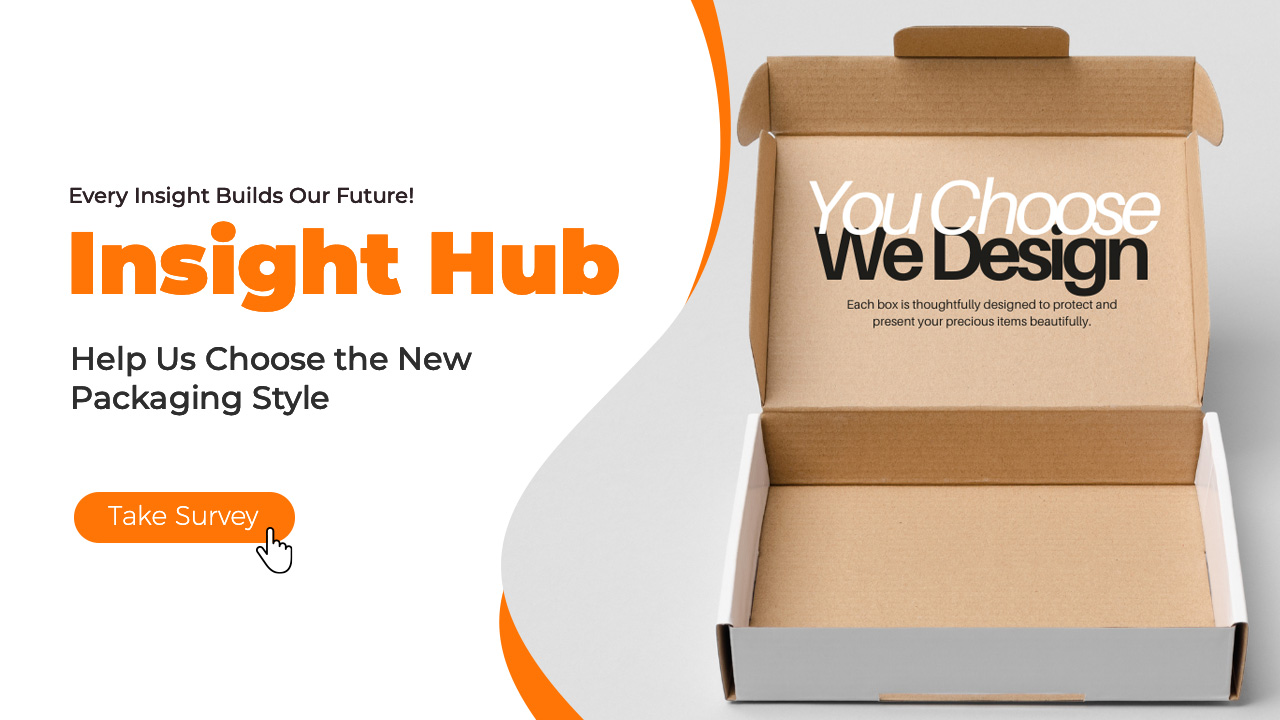
Welcome back to another exciting round of Insight Hub – the place where your voice sparks innovation.
Insight Hub Vol.09 is here!
This time, we’re turning to you to help shape something super important – our new machine packaging style!
A beautiful package isn’t just a box — it’s the first step in your crafting journey. We want to make that moment even more special, and your input can help us get it just right.
I love that LOKLiK is asking for our input. Just took the survey, it’s great to be part of a community that helps shape what comes next! it makes using the machines even more enjoyable when you know your voice is heard.
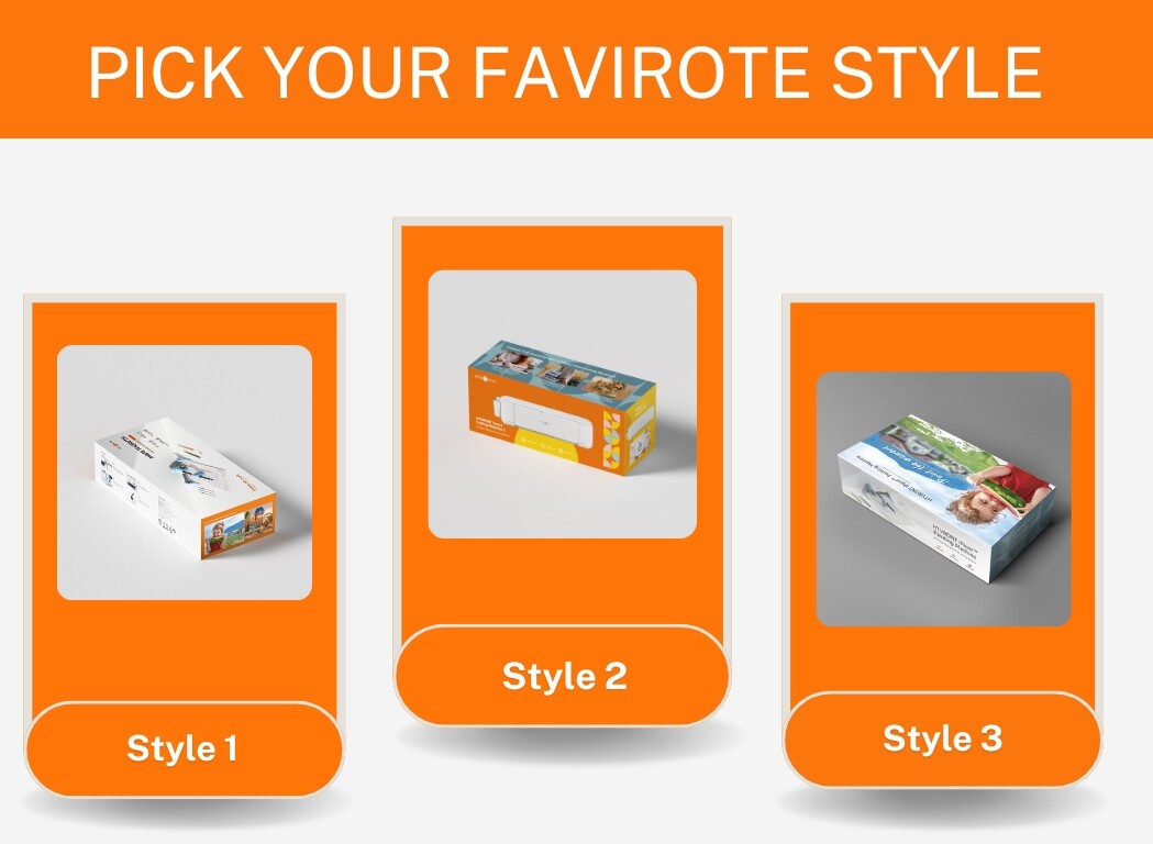
I choose design one, simply because it’s simple design focuses on the item itself rather than bold packaging,( although I love bold packaging it only relates to certain niches ) but when it comes tech I feel the packaging the more simple it looks the more value the item holds,
For instance design 2 looks like a toy box and I wouldn’t look twice at it, it would probably attract the younger audience.
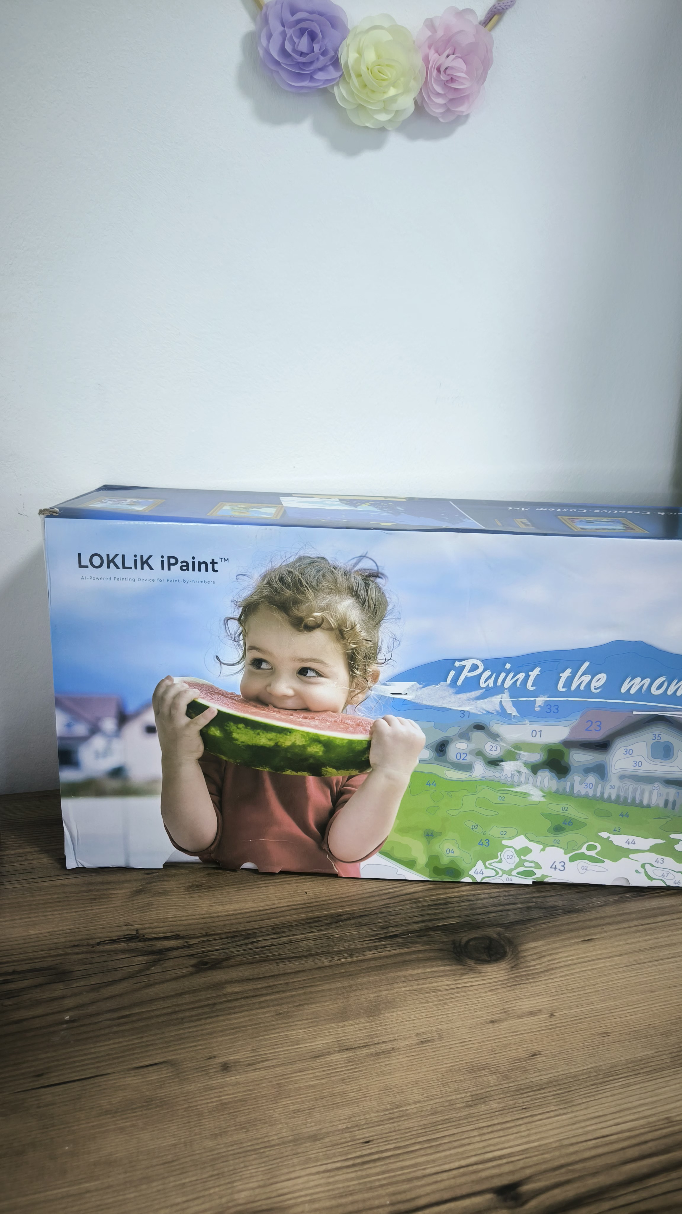
Design 3 is already made for the Ipaint, i found it beautiful and full of life and it serves the purpose the way the picture is made and shows its a drawing made with the machine with numbers o found ot beautiful but it may not suit other machines .
In my personal opinion, “packaging style” is all about the graphics/prints, colors, branding & the like. I don’t focused about the “shape” of the box coz that would be my least concern coz if I picked #1 & #3, probably the cutting machine won’t fit inside those boxes. If I picked # 1 & #2, then probably the ipaint machine won’t fit either and so on and so forth….Therefore, I picked packaging style NUMBER 2! Most of the elements that a customer would want to look and buy are present at number 2. Currently, HTVRONT/Loklik just merged in one so I assumed they will established their brand colors soon as well as they have already established their logos as one. Also, the picture of what’s inside the box is very important and other prints that would say what’s included in the box.
When my husband brought the box upstairs I was like ohh what’s that beautiful thing my husband bought then I looked closer and found out it was the Ipaint so I felt it’s really a cool design for it.
I picked style #2 regardless of the shape of the box. Branding logos, checked! Colors, checked! Graphic designs and prints, checked! What else did I missed?
I picked style 2. The branding was clear, product recognition was clear, had images showing this about the product. Color scheme is ok, I would probably only limit the colors to 3 to get a more cohesive pattern across the whole box. Do the orange for HTVRont and the blue for LOKLiK and then a color to tie them together. Like yellow or purple. Style one is to plain and not eye catching enough. I don’t think it inspires either, being a craft machine box that’s not great. Style 3 when I first glanced at the box I had no idea what was in it. It’s pretty but I don’t get what a kid eating a watermelon has to do with painting. It’s not very eye catching either and the branding is not clear. Doesn’t have the HTVRONT colors or logo on it. 4 was pretty much 2 but no pictures, to many words on your package and no one will read them. That’s my opinion anyway. It’s interesting to read why people chose their answers and why.
I choose style 2 or 4 because it establishes the brand colors, they’re easier to spot as well and wouldn’t simply blend in with other products in a store. For me they’re more eye-catching
Insight Hub Vol.09 is here!
Let’s Share!